Introduction
Color theory is a vital element of graphic design that helps designers create visually appealing and harmonious designs. It encompasses the principles and techniques used to choose and arrange colors in a way that is aesthetically pleasing and effective in conveying a desired mood or message. In this post, we will discuss the basics of color theory and how it can be applied in design to create cohesive and effective designs.
The Color Wheel and Color Harmony
A color wheel is a fundamental tool in color theory that is used to visualize the relationships between different colors. It is typically made up of 12 colors: the primary colors (red, yellow, and blue), the secondary colors (orange, green, and purple), and the tertiary colors (yellow-green, blue-green, blue-purple, red-purple, red-orange, and yellow-orange). These colors are arranged in a circle, with the primary colors positioned opposite each other and the secondary and tertiary colors located between them.

One of the key principles of color theory is color harmony, which refers to the use of colors that work well together and create a cohesive and balanced design. There are several different types of color harmonies, including complementary, split complementary, analogous, and triadic.
Complementary colors
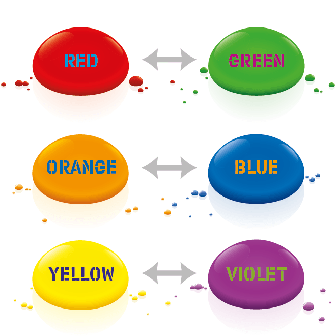
Complementary colors are those that are located opposite each other on the color wheel, such as red and green or blue and orange. These colors tend to create a strong contrast when used together, making them ideal for drawing attention to specific elements in a design.

Split complementary colors
Split complementary color schemes involve using a primary color and the two colors on either side of its complement. For example, a split complementary scheme using blue might involve using blue, yellow-orange, and red-orange. This type of color harmony creates a more subtle contrast than complementary colors, making it a good choice for designs that need to be balanced but not too bold.

Analogous colors
Analogous color schemes involve using colors that are next to each other on the color wheel, such as blue, blue-green, and green. These colors tend to create a harmonious and cohesive design, making them a good choice for designs that need to be calming and cohesive.

Triadic colors
Triadic color schemes involve using colors that are evenly spaced around the color wheel, such as red, yellow, and blue. These colors create a strong visual contrast and can be used to create bold, dynamic designs.

Tints and Shades
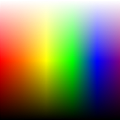
In color theory, the tint of a color refers to a lighter version of a color produced by adding white to it. For example, a tint of red would be pink. The opposite of a tint is a shade, which is created by adding black to a color. The process of creating tints and shades is known as toning.
Tints and shades play an important role in color theory because they can be used to create a wide range of variations of a single color, which can be used to create more nuanced and visually interesting designs.
Hue & Saturation
Hue: This is the purest form of a color and is often used to refer to the “name” of a color, such as red, blue, or yellow.
Saturation: This refers to the intensity or purity of a color. A color that is fully saturated is considered to be “bright,” while a color that is less saturated is considered to be “dull.”

The Meaning of Colors

In addition to creating harmony, colors can also convey specific moods and emotions. Different colors are associated with different feelings and can be used to evoke certain emotions in a design. For example, red is often associated with energy and passion, while blue is often associated with calmness and stability. Yellow is often associated with happiness and optimism, while green is often associated with nature and tranquility.
Choosing the Right Colors for Your Design
When choosing colors for a design, it’s important to consider the overall aesthetic and the target audience. Different colors will appeal to different audiences and can impact how the design is perceived. It’s also important to consider the context in which the design will be used, as certain colors may be more or less appropriate depending on the situation.
One example of when it’s important to consider the context in which a design will be used is when designing for a website or app. Different colors can affect the usability and readability of a design, depending on the background and text colors used. For example, using a light blue background with white text may be visually appealing, but it may be difficult to read for some users, especially those with certain visual impairments. In this case, it may be more appropriate to use a darker background with lighter text to improve readability.
Another example is when designing marketing materials or branding for a company. The colors used in the design should be consistent with the company’s brand guidelines and should also be appropriate for the target audience. For example, a company that sells children’s toys might want to use bright, playful colors in its marketing materials, while a financial institution might want to use more professional, conservative colors.
In both of these examples, it’s important to consider the context in which the design will be used and choose colors that are appropriate and effective in that specific context.
Conclusion
Color theory plays a crucial role in graphic design, helping designers create visually appealing and effective designs. By understanding the principles of color theory and applying them in the right way, designers can create harmonious color schemes and effectively convey specific moods and emotions.

