Introduction
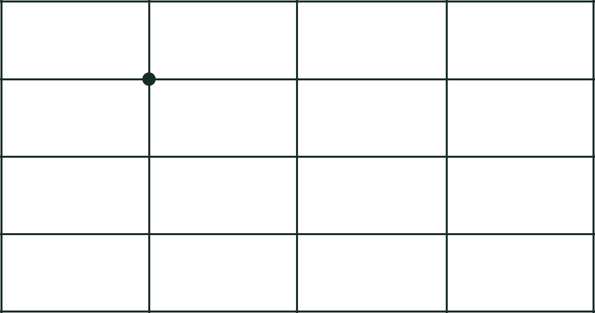
Grids are a fundamental tool in graphic design, used to create balanced and organized layouts. A grid is a series of intersecting lines that divide a layout into columns and rows, creating a framework for placing design elements. Grids help to establish a visual hierarchy, guide the viewer’s eye, and create a cohesive and harmonious design.
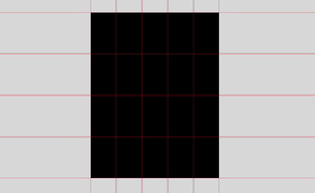
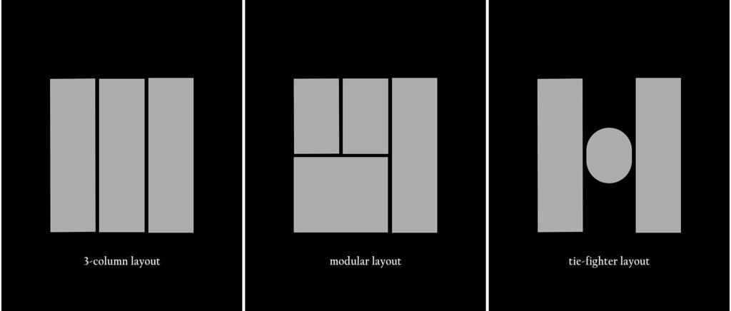
There are different types of grids that can be used in graphic design, including column grids, modular grids, and hierarchical grids. Column grids are the most common type of grid, dividing a layout into a series of vertical columns. Modular grids are more flexible, dividing a layout into a series of cells that can be rearranged to fit the specific needs of the project. Hierarchical grids are used to establish a hierarchy of information, with larger elements placed on the top and smaller elements placed on the bottom.
The use of grids in graphic design can be traced back to the early days of print design when grids were used to create balanced and organized page layouts. Today, grids are still an essential tool in graphic design, used in a variety of projects, from print designs to digital designs. By using grids, designers can create cohesive and harmonious designs that are visually appealing and easy to understand.
Grids are an important consideration for any designer, as they help to create a strong visual hierarchy and guide the viewer’s eye through the design. By using grids to establish a hierarchy of information, a designer can clearly communicate the most important elements in the design and draw the viewer’s attention to them. Grids can also be used to create a sense of balance and harmony in a design, helping to create a cohesive and visually appealing layout.
In addition to their role in print design, grids are also an essential tool in web design. In web design, grids are used to create responsive and user-friendly layouts that adjust to different screen sizes and devices. By using grids to structure web pages, designers can create a consistent and easy-to-navigate user experience.
In the following sections, we will discuss the role of grids in creating a strong visual hierarchy and the benefits of using grids in web design. We will also offer tips for implementing grids effectively in design projects and provide examples of how grids have been used effectively in both print and digital design.
The Role of Grids in Creating a Strong Visual Hierarchy
One of the main roles of grids in graphic design is to create a strong visual hierarchy. A visual hierarchy refers to the way that elements in a design are arranged to show their importance or relationship to one another. By using grids to establish a hierarchy of information, a designer can guide the viewer’s eye and clearly communicate the most important elements in the design.
There are a few ways to use grids to create a strong visual hierarchy. One way is to use grids to align elements in a logical and consistent manner. By aligning elements to the grid, a designer can create a sense of order and structure, making it easier for the viewer to understand the information. This technique can be especially effective in creating a cohesive and harmonious design.
Another way to use grids to create a strong visual hierarchy is to use them to create visual breaks between different sections or pieces of information. By using grids to separate and group elements, a designer can create a clear hierarchy and guide the viewer’s eye through the design. This technique can be especially effective when combined with other design elements, such as size, color, and font-weight, to create emphasis and hierarchy.
Examples of how grids have been used effectively in creating a strong visual hierarchy include using them to align elements in a consistent and logical manner, or to create visual breaks between different sections of information. By creatively using grids to create a strong visual hierarchy, a designer can guide the viewer’s eye and effectively communicate the intended message.
The Benefits of Using Grids in Web Design
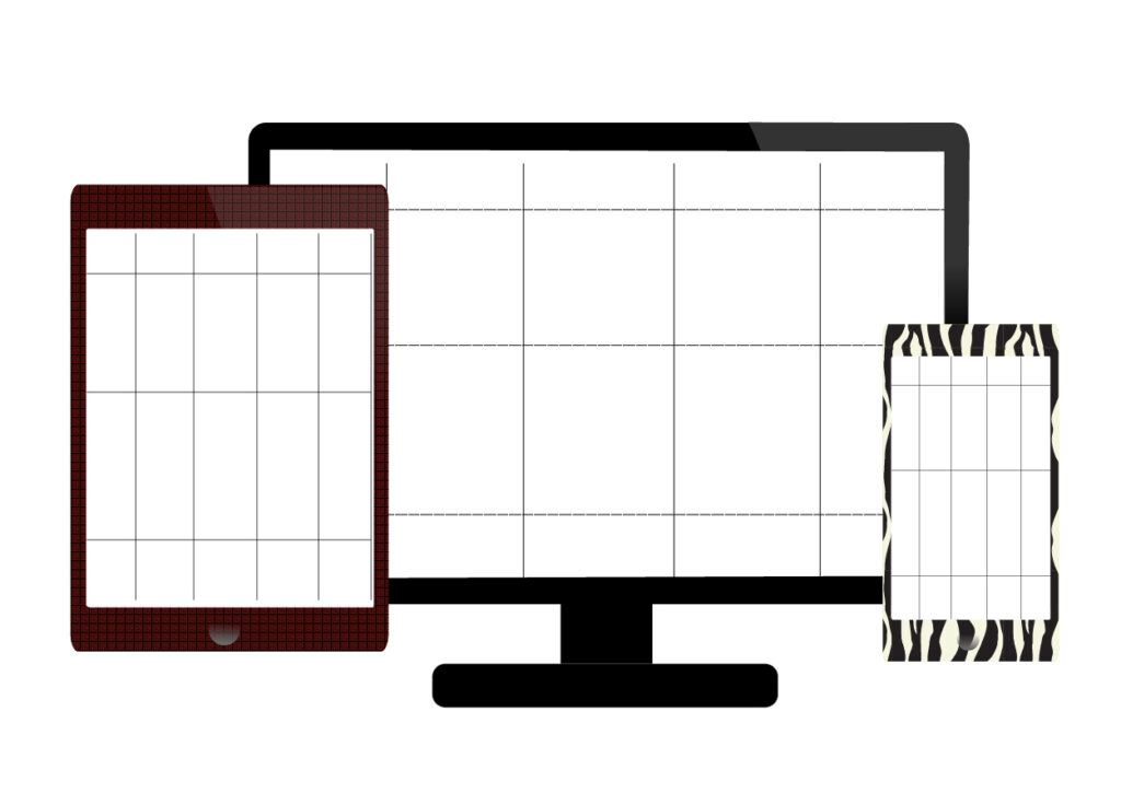
In addition to their role in print design, grids are also an essential tool in web design. In web design, grids are used to create responsive and user-friendly layouts that adjust to different screen sizes and devices. By using grids to structure web pages, designers can create a consistent and easy-to-navigate user experience.
There are a few benefits to using grids in web design. One benefit is that grids help to create a responsive design that adjusts to different screen sizes and devices. By using grids to structure web pages, designers can create layouts that adjust to the specific dimensions of different screens, ensuring that the design looks good and is easy to use on any device. This is especially important in today’s digital landscape, where users access the internet from a variety of devices, including phones, tablets, and laptops.
Another benefit of using grids in web design is that they help to create a consistent and cohesive user experience. By using grids to structure web pages, designers can create a cohesive and harmonious design that guides the viewer’s eye and creates a sense of order and structure. This can make it easier for users to navigate the website and find the information they are looking for.
Examples of how grids have been used effectively in web design include the use of grids to create responsive layouts that adjust to different screen sizes and devices, or the use of grids to create a consistent and cohesive user experience. By creatively using grids in web design, designers can create responsive and user-friendly websites that engage the viewer.
Tips for Implementing Grids Effectively in Design Projects
Implementing grids effectively in design projects requires careful consideration and attention to detail. Here are a few tips for implementing grids effectively in design projects:
- Consider the overall design aesthetic and goals: Before implementing a grid, it’s important to consider the overall design aesthetic and goals. What type of grid will best suit the specific needs of the project? Is a column grid, modular grid, or hierarchical grid more appropriate?
- Adjust the grid structure to fit the specific needs of the project: Once you have chosen the appropriate type of grid for the project, it’s important to adjust the grid structure to fit the specific needs of the project. This might involve adjusting the number of columns or rows or adjusting the size of the cells.
- Use grids as a starting point, rather than a strict rule: It’s important to remember that grids are a tool, not a strict rule. While grids can be a helpful starting point for a design, it’s important to be flexible and make adjustments as needed to achieve the desired aesthetic and goals of the project.
By following these tips, designers can effectively implement grids in their design projects and create balanced and organized layouts that engage the viewer.
Conclusion
In conclusion, grids are an essential tool in graphic design, used to create balanced and organized layouts and establish a strong visual hierarchy. Grids are also an important consideration in web design, used to create responsive and user-friendly layouts. By using grids effectively in design projects, designers can create cohesive and harmonious designs that are visually appealing and easy to understand.
To implement grids effectively in design projects, it’s important to consider the overall design aesthetic and goals, adjust the grid structure to fit the specific needs of the project, and use grids as a starting point, rather than a strict rule. By following these tips, designers can effectively incorporate grids into their designs and create balanced and organized layouts that engage the viewer.